I am considering purchasing a couple of advertising spots for the upcoming holiday season for my Fairyfolk shop. The hardest part is trying to decide on what my advert should look like. I have put 4 together and would love your input on them. YOU are my demographic… which one might get you to click on to see what my shop is all about?
 |
| A) |
 |
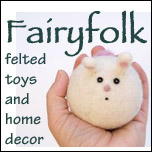
| B) |
 |
| C) |
 |
| D |
Do you have any suggestions to improve them, any insights. Do you think there is a different image from Fairyfolk I should use instead? Should I word it differently? Help, help, help :-)
Honestly, any and all help and insights will be GREATLY appreciated.
Blessings and magic,
Donni


62 Responses
C) gets our vote! :)
I choose C. It is more eye catching. but I guess you would also have to be sure you had plenty of pumpkin mice (apple mice, pear mice?) for sale, too.
My alternative is D. Because it looks more unique and would be just the thing for quite a few little imaginations whether for fairies or for dragons, or for other games that need a ready made wood.
Sandy in the UK
I like D the best, it has a wider range audience wise. Good luck!
well, B has both the toys and home decor, but b/c we’re so crazy about toadstools around here, they would catch my attention first on a side bar. And they are different. Maybe put a felted toy with the toadstool?
best to you…
Hi Donni,
I choose B, it shows more than just one item that you make and the writing is nicely spaced out. Love it!
xo xo
Linda
C gets my vote! I like the simplicity of it- and of course, it’s very cute.
I like c, but then again im a sucker for anything fall related:P
any of them except B. my fav is A but i really like D as well.
I like C!
I choose D. I think they look great, I wouldn’t change the wording at all.
C or D works for me :)
c is my fave
I really like the font you chose. I think D is my favourite! I wish you much success with this endeavour!
I would redo this with the log and toadstool from D in the background, the mouse sitting against or on top of the log to contrast with the brown, then some of the acorns tossed in front of the log. Do you have more critters to put on the log?
Please let me know when you decide on an ad and I’ll post it on my blog.
I like the first and last ones best.
i like b and d. b is nice because it shows a couple of items, but i agree….mushrooms will always catch my eye!
All are nice, but I like C the best.
My vote would be for D. It’s adorable and the Woodland theme never gets old (at least not for me!)….
Oh my gosh… you guys are giving me such excellent feedback… thank you so much and keep it coming :-)
Blessings and magic,
Donni
Tough choice!! I’ve decided to cast my vote for “B” because it shows a toy *and* a home decor item. Perhaps a very thin black border around each of the two pictures might separate them a wee bit?
Whichever you choose, I’m sure you’ll get lots of interest : )
Janet, FeltOnTheFly
I like the first one the least, because there is no color in it. I really like the last one. But I also like the 2nd and 3rd. Maybe a combination of the last 3. I don’t know.
C or D. I like C the best. :o)
Good Luck choosing, they’re all so cute!
Wendi
I like C or D. I’ve purchased your acorns before and they are adorble!
D is beautiful! I really like it! And then… for other improvements I would most likely suggest another font… I guess the font you used is Papyrus, or at least, something similar. I would use something more eye catching, something beautiful for the title “Fairyfolk”. And then a very plain font for the rest of the text.
D is my favorite. It’s playful and home decory at the same time. C is also nice. I think the pics in B gets too small, and it looks a little busy and A is not as colorful. It’s easy to read your text and title…how about the font you used on Etsy for the title?
I like A. It really stands out to me
Definitely D. It is full of enchantment and the font is perfect.
C! The color splash and the cuteness make it my choice.
I like B best as it has two images on it so shows more of your lovely creations.
B or D – for the very same reasons Mama Rae already posted. (:
I think B fits your shop the best, but I think D is definitely the most eye catching. I just adore little toadstools :)
i love them all, but vote for C.
I like B the best but I think C is the most eye catching.
I love A because it is so cute. I think that it will be also easier to spot if it around other ads.
C stands out as exceptionally cute and not just “waldorfy”
I like D best. Maybe it would be cute to have D with felted acorns around it.
I like C, it is great!
C is the best – the colours look great and it makes one want to look further. It definitely gets my vote and thanks for your blog, I love reading it.
C
I like the pop of orange on C which is eye catching. The Shop’s title is not fighting for attention like B and D.
D. Without a doubt, definitely D. I love it!
I just had a look at your shop… I love the image of the “chocolate bunny” (and also the needlefelted nest with robins eggs, tho’ I guess that’s perhaps a springtime image, not associated with the winter holiday season?)
Good luck!
MB
And just spotted the magical hanging toadstools — that’s a lovely photo/shop item, too…
Hi,Donni!
Everything you make is lovely and perfect! Just soooo perfect! I’m watching your blog for a couple of years now.
My opinion is that you can make a scene in nature with your wonderfull things,that is a game for kids and moms already itself! I love the pictures that transfer me into another magic world and remind me of my childhood’s fairy-tales! a bunny,a mouse, a toadstool and some acorns thrown around through some grassand a little log… i’m sure you know what i mean!
the tittle is ok,the letters are coming from a fairy-tale too.
I trust your sense of nature and DO your magic!!! ;-)
love from Greece, Vaya!
You could also put these little ones into your fairy garden for a more natural and eye-catching result. Everyone want to be part of a fairy-tale or see a little fairy,an enchanted pumkin with a mouse in it and some hanging acorns of Joy! ;-)
love from Greece, Vaya.
Hi xxx
I was immediatly drawn to D
it’s beautiful and quite open ended
xxxx best of wishes xxx
B or D gets my vote.
Definitely C!
I like either B or D!
I like D!
I like C best. I’ve seen the acorns from other shops (very cute!), but the little fellow poking out of the pumpkin is truly special!
D is my pick.
The orange color of C catches my eye. The message is short and to the point.
C is okay, but D is my absolute fav.
Kathi
Choice C. It is still cute and “Waldorfy” but it will also catch the Montessori mom’s eye!!! My daughter would not play much with mushrooms (although they are so cute), but she would BEG me to get her the little animal in the pumpkin or acorn. If you use C, though, I would change it up for December holidays (maybe in November???). I like how your tag line is at the bottom of D and, if it were me, I would change C’s text placement to look more like D.
C pops for me – but says toys (not decor) and you know how much people read ;) – C made me look.
D I like better, D would make me click.
But depending on where you advertise, if the site is more toy/children based, go C, more decor go D?
I like B and D. B because you can see 2 items and D because who doesn’t love a toadstool :)
I love D!!!
C or D are my favorites :)
My favorite is D, I love the toadstool and the simplicity of it. I think B is too busy, the objects don’t go together.
Good luck!
Haha well being that looking at all of them made me want to go to your store I think you did great! But my personal favorites are B and C. C is probably my fave because it is super cute and unique. When do you ever see a cute mouse in a pumpkin!? But B is good as well because it shows 2 things (cute mouse included!)
D is my least favorite to me because it is the most typical Waldorf product image to me and you can see that anywhere. Honestly I don’t know if I would click on that one if I saw it by itself somewhere..
That mouse really takes the cake though! Seriously I kind of want him under our table stealing our cake crumbs the next time we have cake… ^^
I would choose D.
They are all beatiful ads. If you want to improve them you can add a color for the back.
I definitely choose “C”. I would have to click on the cuteness!